
Why Navigation Problems Are Hard to Notice, Until You Try to Use Them
Navigation rarely fails in obvious ways.
Buttons are clickable. Pages load. Menus expand. From a product team’s perspective, everything looks functional.
But the real test of navigation isn’t whether it works. It’s whether it works without making the user think too much.
And this is where things quietly break.
You open an app to do something simple, update your email, download an invoice, change a password. You expect it to take a few seconds. Instead, you find yourself moving between sections that seem related, but don’t quite lead where you expected.
Nothing is technically wrong. But something feels off.
That “off” feeling is what poor navigation looks like in the real world.
For any ui ux agency, diagnosing this kind of friction requires looking beyond layouts and labels. It means understanding how users assume things are organised, and where that assumption breaks. In practice, this is an information architecture problem: the way categories, labels, and hierarchy are structured either matches how users think, or it doesn’t.
A Simple Test: “Where Would You Look First?”
One of the most effective ways to evaluate navigation is surprisingly basic.
Take any common task and ask:
If you had never used this product before, where would you go first?
Now compare that answer with where the feature actually lives.
The gap between those two is where navigation problems begin.
A Real Scenario: Updating Personal Details
Let’s say a user wants to update their phone number.
Most people mentally map this to:
- Profile
- Personal Information
- Account
But in many products, the actual path looks like:
- Settings → Security → Login Details → Contact Info
Each step individually makes sense. But together, they don’t match the user’s expectation.
So what happens?
The user:
- checks Profile first
- doesn’t find it
- moves to Settings
- explores multiple sections
- finally lands on the right place
This is not a usability failure in the traditional sense. It’s a navigation logic mismatch, and at its root, an information architecture mismatch, where the system’s categories don’t map to the user’s mental model.
And these mismatches are far more common than teams realise.
Depth: When “Just One More Click” Keeps Adding Up
Depth becomes a problem when users have to keep confirming they’re on the right path.
Not when there are multiple levels, but when each level introduces uncertainty.
What Depth Feels Like to a User
It doesn’t feel like “five levels of navigation.”
It feels like:
- “Maybe it’s in here…”
- “No, not here either…”
- “Let me try another section…”
That mental loop is what creates fatigue.
Where Depth Usually Goes Wrong
Depth tends to increase gradually over time.
- A new feature gets added under an existing category
- Another subcategory is introduced to “organise things better”
- Labels become more specific, but also more fragmented
Individually, each decision seems reasonable. Collectively, they create distance between the user and their goal.
A More Useful Way to Think About Depth
Instead of asking “How many levels do we have?”, ask:
- How many decisions does a user need to make before completing a task?
- At which step do they start second-guessing their choice?
Because the moment users start doubting their path, depth has already become a problem. In information architecture terms, this is a hierarchy problem, too many decision points stacked between the user and their goal.
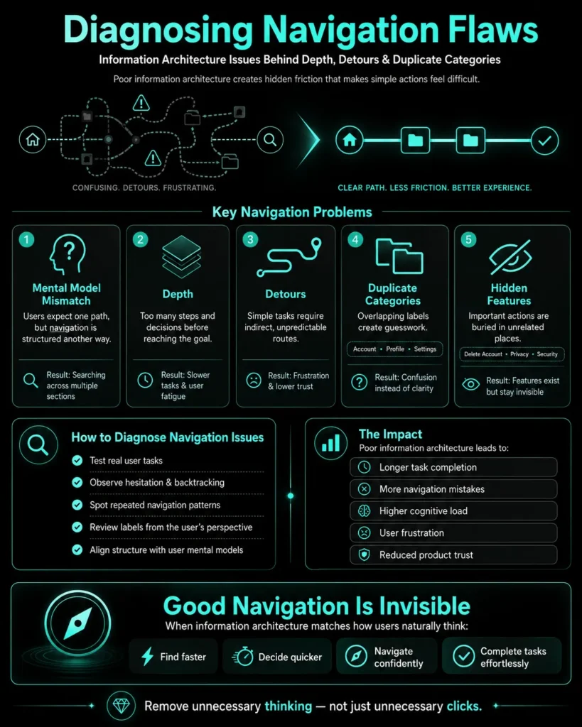
Detours: The Silent Disruptor in Navigation
Detours are harder to spot because they don’t always look like errors.
They look like alternative paths that shouldn’t be necessary.
A Familiar Example: Downloading an Invoice
A user wants to download an invoice. Their expectation is straightforward:
Billing → Invoices
But instead, the structure leads them through:
Orders → Order History → View Order → Documents → Invoice
Now, think about what the user experiences:
- “Why is this under orders?”
- “Is invoice the same as receipt here?”
- “Did I miss a billing section somewhere?”
At no point is the system broken. But the user is constantly adjusting their understanding.
That adjustment is friction.
Why Detours Matter More Than Depth
Depth slows users down.
Detours make them uncertain.
And uncertainty is more damaging than delay.
Because once users stop trusting their path, they stop moving confidently.
Duplicate Categories: When the System Starts Competing With Itself
If depth and detours are structural problems, duplication is a clarity problem, and one of the clearest signs of weak information architecture.
And it’s one of the most common issues in growing products.
What It Looks Like in Practice
You’ll often see navigation with labels like:
- Account
- Profile
- Settings
Each of these contains overlapping elements.
So when a user wants to change something, say, their email, they pause.
Not because they don’t understand the task.
But because they don’t know where it belongs.
The Problem Isn’t Redundancy, It’s Ambiguity
Multiple categories are not inherently bad.
The issue is when categories are:
- conceptually similar
- poorly differentiated
- inconsistently structured
At that point, users are no longer navigating, they’re guessing.
How This Builds Over Time
Duplication rarely happens intentionally.
It usually comes from:
- different teams adding features independently
- no single owner responsible for the product’s information architecture
- incremental updates without restructuring
The result is a system that reflects how the product evolved, not how users think.
Hidden Pages: When Important Actions Are Technically There, But Practically Invisible
Some of the most critical features in a product are also the hardest to access.
Not because they’re meant to be hidden, but because they were never properly surfaced.
A Common Case: Deleting or Deactivating an Account
Users expect to find this under:
- Account Settings
- Privacy
- Security
Instead, they often have to:
- search for help articles
- follow indirect links
- go through multiple confirmations
Now, some friction here is intentional. But the problem arises when the path feels unclear rather than deliberate.
Visibility vs Accessibility
Just because something exists doesn’t mean it’s accessible. This is where information architecture and visibility intersect: a feature can be technically present and still be architecturally buried.
If users have to:
- search externally
- rely on guesswork
- or navigate unrelated sections
then the feature is effectively hidden.
How to Actually Diagnose These Issues (Without Overcomplicating It)
You don’t always need complex tools to identify navigation flaws. What you need is a shift in how you observe behaviour.
Start With Real Tasks, Not Screens
Pick a few common actions:
- update profile details
- download documents
- change account settings
Now try completing them as a new user would.
Notice where you:
- hesitate
- explore multiple paths
- feel unsure
Those moments are more valuable than any heatmap.
Look for Repetition in Movement
If users repeatedly:
- go back to the main menu
- switch between similar categories
- open multiple sections before finding the right one
it’s a sign the structure isn’t clear.
Pay Attention to Language
Sometimes the issue isn’t placement, it’s wording.
A label that makes sense internally might not match how users think.
And when language doesn’t align, even well-structured navigation can feel confusing.
Why This Matters More Than Teams Expect
Navigation issues don’t usually trigger direct complaints.
Users don’t say:
“Your information architecture is flawed.”
They say:
- “This took longer than expected”
- “I couldn’t find it easily”
- “I had to look around a bit”
Individually, these seem minor. Collectively, they shape perception, and collectively, they’re almost always a symptom of information architecture that grew reactively instead of being designed intentionally.
Over time, the product starts feeling:
- harder to use
- less intuitive
- slightly frustrating
And that perception is difficult to undo.
What This Means in Practice
For teams working on digital products, improving navigation is less about rearranging menus and more about removing unnecessary thinking.
At UX Prosperar, this usually involves stepping back from the interface and its underlying information architecture, asking simpler questions:
- What is the user trying to do here?
- Where would they expect to find it?
- What is making them pause?
Because once those answers are clear, the structure often becomes obvious.
And when the structure is right, users don’t notice navigation at all.
They just move.
Closing Thought
Good navigation doesn’t draw attention to itself.
There’s no moment where a user thinks, “That was a well-structured menu.”
Instead, the experience feels smooth, predictable, and effortless.
And that’s the real goal.
Not to impress users with organisation, but to make sure they never have to think about it in the first place.
Typical project duration: 4–8 weeks, depending on scope.

At UX Prosperar, we don’t believe in one-size-fits-all. Every project has its own goals, users, and challenges, so the services we use depend on your specific requirements. Here’s how our offerings fit together to create products that both look stunning and work flawlessly.
1. UI/UX Design for Web, Mobile & SaaS
We design responsive, conversion-focused interfaces that adapt seamlessly across devices and platforms, whether it’s a corporate website, a mobile app, or a SaaS dashboard.
Often paired with:
- UX Research to understand your users before designing
- Wireframing to map the user journey before final visuals
2. UX Design and Research
Before any pixels are drawn, we dig into user interviews, usability testing, competitor analysis, and data review. This ensures every design choice is validated and goal-driven.
Often paired with:
- Customer Journey Mapping to align every touchpoint
- Usability Studies for deeper, real-world user insights
3. User Interface Design & Product Design
We simplify complex workflows into clear, user-friendly interfaces, from mobile apps to enterprise software. Our goal is to make interaction effortless and intuitive.
Often paired with:
- Design Sprints to rapidly prototype and validate ideas
- Content Strategy & UX Copywriting to ensure words guide users naturally
4. Product Design Services & Product Development Consulting
For startups and enterprises, we can support the entire journey, from early ideation to launch. You decide how deep we get involved.
Often paired with:
- Wireframing & Prototyping for early validation
- Usability Testing before development investments
5. Wireframing & Interactive Prototypes
Before code, we bring your product to life in clickable prototypes. This lets you test, iterate, and refine early, saving development time and cost.
Often paired with:
- UX Research to validate the flow with real users
- Design Systems to ensure consistency when scaling
6. Usability Testing & Usability Studies
We go beyond theory. We put your product in front of real users and watch how they interact. From quick hallway tests to in-depth usability studies, we gather insights that refine your product to be intuitive, smooth, and conversion-friendly.
Often paired with:
- UX Audits for a full product health check
- Customer Journey Mapping to ensure every touchpoint works together
7. Customer Journey Mapping
We map every step your users take before, during, and after using your product. This ensures all touchpoints feel connected and intentional.
Often paired with:
- Content Strategy / UX Copywriting to guide actions
- UI Design to visually align with the journey
8. Content Strategy / UX Copywriting
The right words help users take the right action. We craft microcopy, onboarding text, CTAs, and content flows that improve usability and conversions.
Often paired with:
- Design Sprints to test language quickly
- UI Design for perfect visual-text alignment
9. Design Sprints
When you need to move fast without compromising quality, we run focused 4-5 day sprints to rapidly ideate, design, prototype, and test ideas.
Often paired with:
- Wireframing & Prototyping for sprint outcomes
- Usability Testing to validate the sprint output
10. UX Audits
Is your product underperforming? We analyze it from usability, accessibility, and conversion standpoints to identify and fix issues.
Often paired with:
- Usability Testing for deeper user insights
- Customer Journey Mapping to spot big-picture issues
For some clients, the focus might be solely on UX Research + Wireframes. For others, it’s a full end-to-end process from research to product launch. The service mix is tailored to your goals, budget, and timeline. Each service is designed to work seamlessly with others for maximum impact.
UX Prosperar: UI/UX Design Agency With a Difference
- Consistent & Scalable Design Systems that grow with your product
- Cross-Device UX & UI Design Services for mobile, web, desktop, and SaaS
- Fast Prototyping & Iteration: see results early and often
- Developer-Ready Assets for smooth handoff and faster builds
Why Choose UX Prosperar for UI/UX Design?
Most agencies focus only on visuals. We start with research-led UX design, understanding your users, your business model, and your market, so your product doesn’t just look great, it performs.
Here’s why our clients love working with us:
- User-Friendly Interfaces – Websites, apps, and dashboards that feel effortless & responsive to use
- Scalable Design Systems – Future-proof designs that grow with your product
- Developer-Ready Deliverables – Clear, organized assets for smooth handoff
- Fast & Transparent Process – See results early, give feedback often
Industries We Serve
SaaS • E-Commerce • FinTech • HealthTech • Logistics • B2B Tools • Corporate Websites
Let’s Design a Product Your Users Will Love
Don’t risk launching a product that confuses users or loses them at the first click.
With UX Prosperar’s UI/UX strategic design services, you’ll get a hybrid, responsive, and scalable design backed by real user insights.
Book Your UX Audit Today
Let’s talk about how we can turn your digital product into something people want to use.