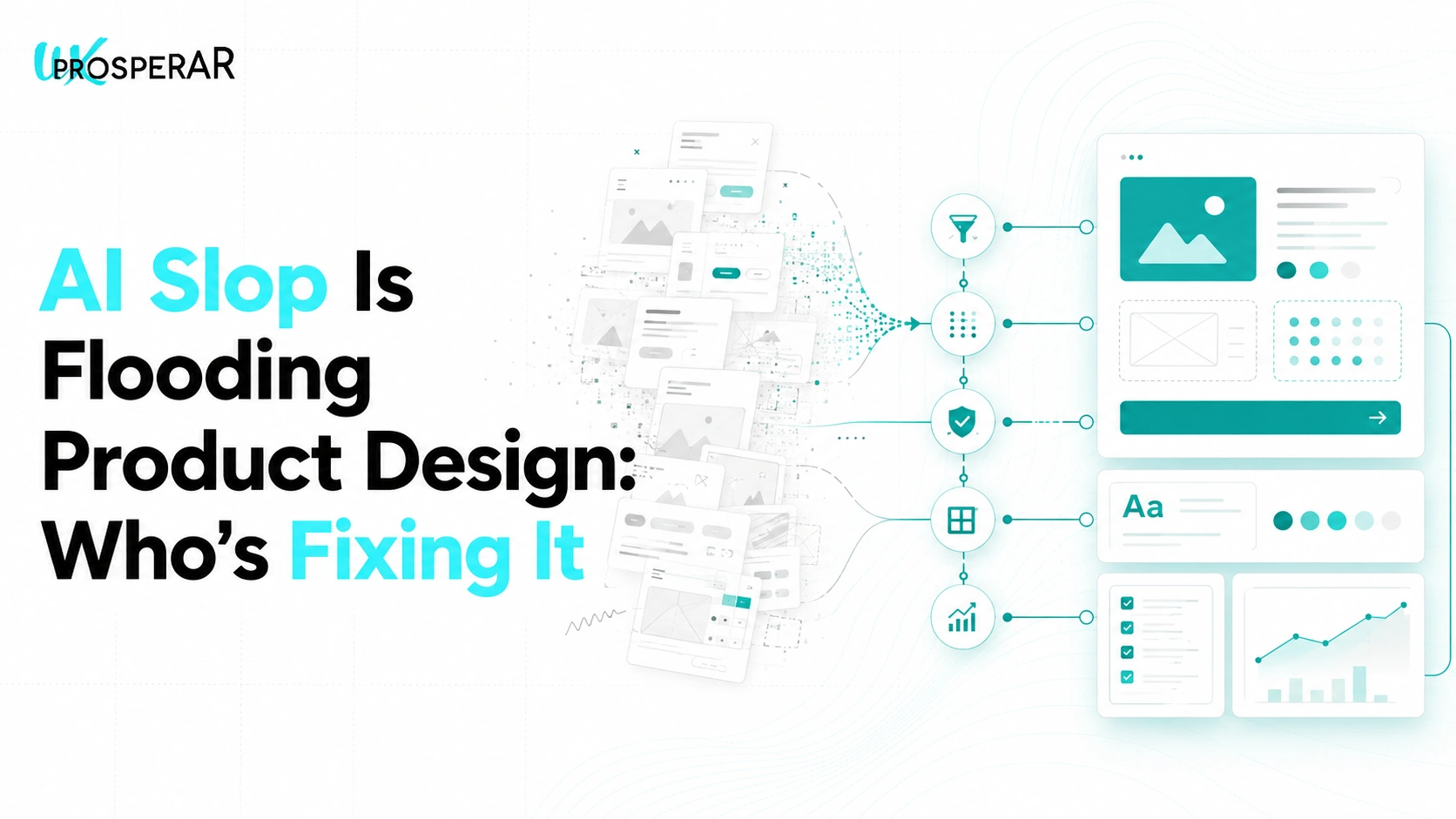
Open any AI design tool right now and type “design me a fintech app dashboard.” In under a minute, you’ll have cards, charts, a sidebar, and a colour palette that looks like it belongs on a real product. It’s clean. It’s on-brand-ish. It even follows most of the textbook UI rules; decent contrast, sensible spacing, a clear hierarchy.
Ship it as-is, and there’s a good chance it quietly underperforms the moment real users touch it.
That gap, between “this looks like good design” and “this actually works for the people using it”, is where the term AI slop has started showing up across design circles. And it’s becoming one of the more interesting shifts happening in our own work at UX Prosperar.
What “AI Slop” Actually Means in Design
The instinct is to assume AI slop just means ugly, obviously broken design; mismatched fonts, cluttered layouts, buttons that don’t look clickable. That version exists, sure. But it’s the easier one to spot and fix.
The more interesting, more common version is different. It’s design that’s technically correct and still slop. Good typography, decent whitespace, solid colour contrast, nothing a design principles checklist would flag. It just isn’t built with any real intent behind it.
Here’s why that happens. When a prompt is vague, something like “make me a website for a logistics business”, the AI doesn’t have a point of view to work from. So it defaults to whatever pattern shows up most often in its training data; the same hero banner, the same three-column feature grid, the same rounded card layout you’ve probably scrolled past a hundred times this month. Individually, none of it is wrong. Collectively, it’s the same product wearing a different logo.
That’s the part that makes it slop: not the absence of polish, but the absence of judgement. Nobody made a decision about this audience, this product, this problem. The AI just averaged out everything it’s seen before and handed that back.
Where Most of This Is Coming From Right Now
A big part of why this is suddenly everywhere comes down to how products get built today. Founders, developers, and product teams are increasingly “vibe coding”; prompting tools like Claude, v0, or Lovable to generate an entire interface, then shipping straight from there, sometimes with barely any design or research input in between.
The appeal makes complete sense. What used to take a design team weeks now takes an afternoon. But speed doesn’t tell you whether the checkout flow makes sense to a first-time buyer, or whether the onboarding screen is using a term your actual users don’t recognise.
Picture a fintech startup in the UAE launching a new savings feature. The AI-generated onboarding flow looks sharp: progress bar, friendly copy, a clean form. Except step three asks for an “IBAN” without explaining what it is or where to find it, because the AI pulled that pattern from Western banking templates it was trained on. Nothing about the screen is objectively “bad design.” It just wasn’t built with this specific user, in this specific market, in mind. That’s the kind of gap that only shows up once you watch a real person try to complete the flow, which is exactly what usability testing is built to catch.
Why “Good” AI Output Still Breaks in the Real World
This is the uncomfortable part for teams leaning hard on AI-generated design: passing every visual design principle doesn’t mean a product will actually perform. AI can check boxes on contrast ratios and grid alignment all day. What it can’t do is sit with your users and notice what’s actually confusing them.
A few things AI consistently misses because it has no way of knowing them:
- Regional and cultural context. An AI-generated Arabic interface that simply mirrors an English layout left-to-right often gets RTL details wrong; icon direction, form field order, even how progress indicators should read.
- Where users actually get stuck. AI can produce a plausible checkout flow. It can’t tell you that users in your product specifically abandon at the payment step because the CVV field is unlabelled on mobile.
- What “done” should feel like for this brand. Two competitors can prompt for the “same” dashboard and get near-identical results, because the AI has no stake in either brand’s differentiation. That’s the exact pattern flagged in a widely shared LinkedIn post recently: AI-generated design can be objectively well-executed and still be slop, simply because nobody directed it with real intent.
None of this is really about AI being bad at design. It’s answering a different question than the one that matters, and it will always say yes to whatever you ask it to build. We’ve written before about why that instinct to push back has to come from a human in the loop, and this is that same idea playing out at the interface level.
The Real Shift: Our Job Is Increasingly Testing and Fixing AI-Built Products, Not Just Designing From Scratch
This is the part that’s changed the most in our own work lately. A growing share of what lands on our desk isn’t a blank canvas anymore. It’s a product that already exists; built fast, often by a developer with an AI tool, sometimes without a single designer or researcher involved until launch is already close.
Our job in those cases looks less like “design this” and more like:
- Audit it. Run the product through a structured UX audit to separate what’s genuinely working from what only looks like it’s working.
- Test it with real users. Put the AI-generated flow in front of actual people from the target audience and watch where they hesitate, misread a label, or give up.
- Trace it back to research. Where the gaps come from a missing understanding of the user, not just a UI tweak, that’s where proper discovery research closes the loop.
- Optimise, not rebuild. Most of the time, the fix isn’t starting over. It’s targeted UI/UX design work on the specific two or three moments where the AI-generated pattern doesn’t hold up for this product’s actual users.
It’s a genuinely different rhythm of work than a from-scratch build, and honestly, one we expect to keep growing. As more products get their first version stood up through AI tools, the value of a team that can look at that output objectively and say “this part is fine, this part will quietly cost you conversions” only goes up.
So Is AI Slop All Bad?
Not really, and it’s worth being fair about that. AI collapsing weeks of drafting into an afternoon is a genuine gain, not a gimmick. The problem was never AI-generated design existing. It’s AI-generated design shipping unchecked, with nobody in the loop asking whether it actually fits the people who’ll use it.
Used well, AI is a fast first draft. The judgement about whether that draft deserves to reach real users still has to come from people who’ve watched real users struggle. That’s the gap testing and optimisation exist to close.
Not Sure If Your Product Is Slop or Solid?
If your team shipped fast with AI and hasn’t put it in front of real users yet, that’s a very fixable, very common place to be. A short round of usability testing usually surfaces exactly what needs attention, before it shows up as a drop in conversions instead.
Let’s take a look at it together.
FAQs
1. What’s the difference between “AI slop” and just a bad design?
A bad design is easy to spot; broken layouts, poor contrast, confusing structure. AI slop is trickier because it often looks correct by every design principle and still fails real users, because it was built from generic patterns rather than any understanding of who’s actually using the product.
2. Is AI-generated design always going to be slop?
No. The issue isn’t the tool, it’s using it without direction or a check afterwards. AI-generated output built from a clear brief, with real user testing before launch, can be perfectly solid. Slop happens when nobody adds that layer.
3. We already launched using an AI-built interface. Is it too late to fix?
Not at all, this is actually where most of our recent work starts. A UX audit and a short round of usability testing usually pinpoint exactly which parts of an already-live product are costing you conversions, without needing a full rebuild.
4. How do you tell if an AI-generated flow is actually a problem, or just looks unfamiliar?
The only reliable way is watching real users attempt it. Assumptions about what “should” be confusing are often wrong in both directions, which is exactly why usability testing exists instead of a design review alone.
5. Does fixing AI slop mean redesigning the whole product?
Rarely. Most of the time it’s a handful of specific moments; a confusing label, a missing cultural cue, a flow step that doesn’t match local behaviour, that need targeted design work, not a rebuild from zero.
Typical project duration: 4–8 weeks, depending on scope.
At UX Prosperar, we don’t believe in one-size-fits-all. Every project has its own goals, users, and challenges, so the services we use depend on your specific requirements. Here’s how our offerings fit together to create products that both look stunning and work flawlessly.
1. UI/UX Design for Web, Mobile & SaaS
We design responsive, conversion-focused interfaces that adapt seamlessly across devices and platforms, whether it’s a corporate website, a mobile app, or a SaaS dashboard.
Often paired with:
- UX Research to understand your users before designing
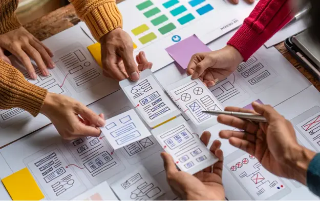
- Wireframing to map the user journey before final visuals
2. UX Design and Research
Before any pixels are drawn, we dig into user interviews, usability testing, competitor analysis, and data review. This ensures every design choice is validated and goal-driven.
Often paired with:
- Customer Journey Mapping to align every touchpoint
- Usability Studies for deeper, real-world user insights
3. User Interface Design & Product Design
We simplify complex workflows into clear, user-friendly interfaces, from mobile apps to enterprise software. Our goal is to make interaction effortless and intuitive.
Often paired with:
- Design Sprints to rapidly prototype and validate ideas
- Content Strategy & UX Copywriting to ensure words guide users naturally
4. Product Design Services & Product Development Consulting
For startups and enterprises, we can support the entire journey, from early ideation to launch. You decide how deep we get involved.
Often paired with:
- Wireframing & Prototyping for early validation
- Usability Testing before development investments
5. Wireframing & Interactive Prototypes
Before code, we bring your product to life in clickable prototypes. This lets you test, iterate, and refine early, saving development time and cost.
Often paired with:
- UX Research to validate the flow with real users
- Design Systems to ensure consistency when scaling
6. Usability Testing & Usability Studies
We go beyond theory. We put your product in front of real users and watch how they interact. From quick hallway tests to in-depth usability studies, we gather insights that refine your product to be intuitive, smooth, and conversion-friendly.
Often paired with:
- UX Audits for a full product health check
- Customer Journey Mapping to ensure every touchpoint works together
7. Customer Journey Mapping
We map every step your users take before, during, and after using your product. This ensures all touchpoints feel connected and intentional.
Often paired with:
- Content Strategy / UX Copywriting to guide actions
- UI Design to visually align with the journey
8. Content Strategy / UX Copywriting
The right words help users take the right action. We craft microcopy, onboarding text, CTAs, and content flows that improve usability and conversions.
Often paired with:
- Design Sprints to test language quickly
- UI Design for perfect visual-text alignment
9. Design Sprints
When you need to move fast without compromising quality, we run focused 4-5 day sprints to rapidly ideate, design, prototype, and test ideas.
Often paired with:
- Wireframing & Prototyping for sprint outcomes
- Usability Testing to validate the sprint output
10. UX Audits
Is your product underperforming? We analyze it from usability, accessibility, and conversion standpoints to identify and fix issues.
Often paired with:
- Usability Testing for deeper user insights
- Customer Journey Mapping to spot big-picture issues
For some clients, the focus might be solely on UX Research + Wireframes. For others, it’s a full end-to-end process from research to product launch. The service mix is tailored to your goals, budget, and timeline. Each service is designed to work seamlessly with others for maximum impact.
UX Prosperar: UI/UX Design Agency With a Difference
- Consistent & Scalable Design Systems that grow with your product
- Cross-Device UX & UI Design Services for mobile, web, desktop, and SaaS
- Fast Prototyping & Iteration: see results early and often
- Developer-Ready Assets for smooth handoff and faster builds
Why Choose UX Prosperar for UI/UX Design?
Most agencies focus only on visuals. We start with research-led UX design, understanding your users, your business model, and your market, so your product doesn’t just look great, it performs.
Here’s why our clients love working with us:
- User-Friendly Interfaces – Websites, apps, and dashboards that feel effortless & responsive to use
- Scalable Design Systems – Future-proof designs that grow with your product
- Developer-Ready Deliverables – Clear, organized assets for smooth handoff
- Fast & Transparent Process – See results early, give feedback often
Industries We Serve
SaaS • E-Commerce • FinTech • HealthTech • Logistics • B2B Tools • Corporate Websites
Let’s Design a Product Your Users Will Love
Don’t risk launching a product that confuses users or loses them at the first click.
With UX Prosperar’s UI/UX strategic design services, you’ll get a hybrid, responsive, and scalable design backed by real user insights.
Book Your UX Audit Today
Let’s talk about how we can turn your digital product into something people want to use.