
Most digital products are designed with one quiet assumption: users are calm, connected, and have time to think.
- They’ll compare options.
- They’ll read content.
- They’ll explore.
But in a crisis, that version of the user changes almost instantly.
Whether it is war, political instability, economic uncertainty, or any large-scale disruption, people do not interact with products the same way. The same user who once browsed comfortably now wants fast answers, clear direction, and reassurance that what they are seeing can be trusted.
This is where UI/UX starts revealing its real strength, or its gaps.
Design that works in ideal conditions is expected. Design that works when people are stressed, distracted, and unsure is what separates thoughtful systems from surface-level ones.
A crisis is not just a disruption in the user journey. It is also a research window. It shows what users value most when their attention, trust, time, and emotional energy are limited.
What Changes in the User’s Mind
During a crisis, decisions do not always become faster. They often become heavier.
A user opening a food delivery app on a normal day may scroll, compare, check reviews, and change their mind a few times. But the same user, when tired or anxious, may not want to explore at all. They just want something reliable, fast, and easy to choose.
- Too many options can start feeling like pressure.
- Clear defaults become more helpful than flexibility.
- Guided journeys feel better than open-ended ones.
This is why simple, focused interfaces often perform better under stress.
Attention also changes. Users may read less, but they notice more.
They may skip long paragraphs, but they quickly pick up on unclear wording, outdated information, vague labels, missing confirmations, or anything that feels unreliable. A small detail like “Updated 2 hours ago” can suddenly become important because the user is silently asking: Is this still valid? Can I trust this? Should I act on it?
So while attention span reduces, sensitivity to trust signals increases.
Familiarity also becomes important. In uncertain environments, people move toward what feels predictable. Known layouts, standard flows, and familiar actions reduce mental effort. This is not the time for clever navigation or experimental UX. What feels creative in normal conditions can feel confusing when users are already overwhelmed.
In crisis, familiarity is not boring. It is supportive.
Why Research During Crisis Is Powerful
A crisis does not only change what users do. It reveals what they truly need.
In stable conditions, users may tolerate friction. They may browse more, compare more, wait longer, and forgive unclear flows because the emotional cost is low.
During crisis, that buffer disappears.
Users become sharper and more selective. They show what matters through what they ignore, where they hesitate, what they abandon, and what they return to again and again.
That is why research during crisis becomes so valuable.
It helps teams understand what users now consider essential, where trust breaks down, which steps feel heavy, what information they need first, what reassures them, and which features suddenly feel unnecessary.
A drop-off in normal times may look like a design or performance issue. During crisis, the same drop-off may reveal something deeper: fear, uncertainty, lack of trust, unclear value, or cognitive overload.
For example, if users stop exploring a fintech app and only check balances, transfer money, and look for proof of transaction, that tells the team what now matters most.
If users abandon a government website because instructions are unclear, the issue is not just usability. It is public trust.
If users hesitate before sharing personal data on a healthcare platform, the issue may not be the form itself. It may be anxiety around privacy and safety.
Research makes these invisible shifts visible.
It also helps teams avoid designing from old assumptions. In a crisis, priorities change quickly. What felt useful last month may feel irrelevant now. What was once a secondary feature may become central. What was once acceptable friction may become the reason users leave.
Teams that research early can spot these changes before they become obvious. They can simplify journeys, rewrite confusing content, add reassurance, and rebuild trust while others are still designing for the old version of the user.
In that sense, crisis research is not only about reacting. It is about understanding the next version of the user before the market fully catches up.
And this is also where a one-time research effort starts to fall short. A single round of interviews or a single usability pass can tell a team what users need *right now*, but it cannot tell them whether that need is a temporary reaction or a lasting shift. Crisis behaviour does not settle in one sitting. It moves, sometimes for weeks, before it stabilises into something teams can actually design for.
That settled state is what teams are really trying to find. And finding it takes more than one look.
How Behaviour Changes in Real Products
Under normal conditions, users often behave like explorers. They browse categories, compare options, and spend time understanding features.
During crisis, that behaviour becomes more direct.
“I opened this app for a reason. Help me complete it quickly.”
Take a banking app. On a regular day, a user may check offers, explore investment options, or browse new features. During uncertainty, they want to check their balance, transfer money, and confirm that everything is secure.
Nothing else matters in that moment.
This has a clear UX implication: navigation depth becomes a liability. If key actions are buried under layers, users will not “learn” the system. They will leave.
Speed also becomes part of the emotional experience. A delay of even a few seconds can create doubt.
- Is this working?
- Should I try again?
- Did something fail?
When the user is already under stress, every extra second feels heavier.
Trust also changes. In stable environments, users may give products the benefit of the doubt. In unstable environments, that benefit disappears. Every piece of information is questioned. Where is this coming from? Is it updated? Can I rely on it?
Small details start carrying more weight: timestamps, confirmation messages, visible sources, consistent labels, clear status updates, and easy access to support.
Not every user questions the product the same way, though. Some adapt quickly, they pick up new digital habits fast and lean into features that offer more control, like real-time balance checks or instant confirmations. Others hold back. They are wary of new flows, new permissions, or new institutional processes, not because the product is flawed, but because the crisis has made them cautious of anything unfamiliar. Good research maps both ends of that spectrum instead of designing for an average user who does not really exist in a crisis.
Privacy becomes sharper too. Users become more careful about permissions, personal data, and platform trust. A vague request like “Allow access to data” may be ignored in normal conditions, but in a high-risk moment, it creates doubt. What data? Why is it needed? What happens if I say no?
Clarity around privacy directly affects adoption.
From Crisis Behaviour to the New Normal
It is tempting to treat crisis UX as a temporary mode, something a team switches into during the disruption and switches back out of once things calm down. But that is rarely how it plays out.
Crisis creates habits. And habits do not reverse just because the crisis has passed.
A user who started checking their bank balance three times a day during an uncertain period may keep doing it long after the uncertainty is gone. A user who grew to expect instant confirmation messages will not tolerate silence again, even in calmer times. A user who once ignored a vague permission request will now read it carefully, every time.
This is the new normal: not a return to the old baseline, but a new one, shaped by what the crisis taught users to expect, fear, and rely on.
The risk for teams is designing for a version of the user that no longer exists. A journey that felt complete before the crisis may now feel incomplete. A flow that once felt secure may now feel exposed. Understanding where the new baseline has settled needs the same seriousness as understanding the crisis itself, and it needs primary research to get there, not assumption.
This is also why crisis research cannot be a single exercise. The new normal does not arrive fully formed. It takes shape gradually, through small, repeated behavioural signals, and teams only see it clearly if they keep looking.
Where This Becomes Most Visible
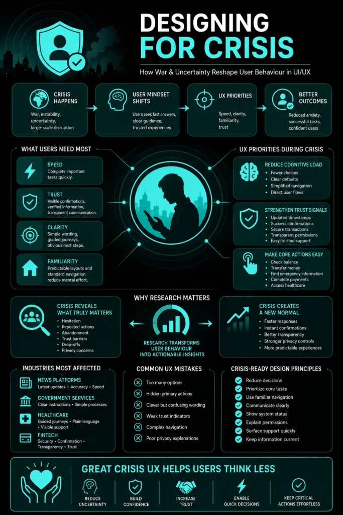
In news platforms, users come with urgency. They want the latest update, clear headlines, quick context, and confidence that the information is accurate. Long-form content still matters, but only after the immediate need is met.
In government platforms, users need instructions, not complexity. Where to go, what to do, what has changed, who is affected, and what action is required next must be clear.
In healthcare, small UX issues can create real consequences. Users are often stressed, unsure, and time-sensitive. They need plain language, guided steps, visible support, and clear next actions.
In fintech, reassurance becomes part of the product. Users check balances more often, move money quickly, and look for proof at every step. Trust is built not only through security, but through stability, transparency, and clear confirmation.
What Designers Often Get Wrong
Many products fail in crisis not because the design is bad, but because the priorities are wrong.
- They overload instead of simplifying.
- They focus on edge features while the core journey is still difficult.
- They confuse visibility with importance.
- They treat content as decoration instead of part of the experience.
But in crisis, the core journey becomes the product.
If users cannot find the main action, complete it easily, and trust the result, everything else becomes secondary.
Clear writing also becomes critical. The wrong word can create doubt. A vague label can slow action. An outdated message can break trust.
What Research Should Ask
Research during crisis should go beyond “Is this easy to use?”
Better questions are:
- What has changed in the user’s priority?
- Where are users hesitating?
- What are they avoiding?
- Which steps feel unsafe or unclear?
- What information do they need before acting?
- What signals make them trust the product?
- Where are journeys stalling?
- Which new behaviours are starting to appear?
These questions help teams understand the reason behind the behaviour, not just the behaviour itself.
A drop in conversion may not mean the offer is weak. It may mean users need more reassurance. A rise in support queries may not mean the product is broken. It may mean the interface is not answering new concerns.
Research helps teams see the difference.
Getting to the new normal also asks something different of *how* research is run, not just what is asked.
Since the new baseline forms gradually, one-off usability tests are not enough. Diary studies and longitudinal interviews, spaced out over weeks, show how routines are adjusting in real time rather than in a single recalled moment. Telemetry, things like feature adoption, drop-off points, and session behaviour, helps confirm whether what users describe in interviews is actually showing up in how they use the product. Support ticket patterns often surface the same signal even earlier, before it shows up anywhere else.
How questions are asked matters just as much as when. Instead of asking users to revisit what happened during the crisis itself, better questions stay forward-looking: What is your biggest roadblock in accessing your finances today? How does this app make you feel in your current environment? This keeps research focused on the present behaviour teams need to design for, without asking users to relive moments that may still be difficult for them.
Design Principles That Hold Up Under Pressure
Good crisis UX does not ask users to think harder. It helps them think less.
- Reduce the number of decisions.
- Bring critical actions closer to the surface.
- Use clear wording instead of clever wording.
- Show loading, success, failure, and next steps clearly.
- Use familiar patterns.
- Keep important information visibly updated.
- Explain why permissions are needed.
- Make support easy to find.
- Remove anything that forces users to figure things out.
These principles are not new. Crisis simply makes them non-negotiable.
What This Means for UX Prosperar
For teams building digital products, crisis should not only be seen as a risk. It should also be seen as a research opportunity.
At UX Prosperar, this connects directly with experience research. The goal is not to study users only when everything is stable. The real value comes from understanding how behaviour changes when users are under pressure, when trust is fragile, and when decisions become emotionally heavier.
It also means not stopping at the crisis itself. The more useful, and harder, work is tracking how behaviour keeps moving after the initial disruption, until it settles into whatever the new normal turns out to be.
This means studying drop-offs, stalled journeys, trust barriers, privacy concerns, hesitation points, content gaps, reassurance needs, and the moments where users stop exploring and start seeking direct action.
These insights help teams build products that do not depend on ideal conditions. They help create journeys that remain clear, useful, and dependable when users are distracted, anxious, or uncertain.
That is where research-led design becomes powerful. It does not just improve screens. It reveals how people behave when the context around them changes.
And in crisis, that understanding can become a serious advantage.
Because the teams that research early can respond early. They can spot behavioural shifts before they become obvious, understand new drivers of trust, and improve conversion by removing the friction users are actually feeling.
In a crisis, users are telling us what matters.
The question is whether we are listening closely enough.
Conclusion
Crisis strips away everything that does not matter.
What remains is simple.
- Can the user complete their task?
- Can they trust what they see?
- Can they do it without thinking too much?
If the answer is yes, the design works.
Not just in crisis, but everywhere else too.
Designing for extreme conditions does not limit a product. It strengthens it.
And researching during crisis does not only help teams understand the moment. It helps them understand the user more honestly.
It also does not stop when the crisis ends. The new normal it leaves behind needs the same attention, the same research, and the same willingness to design again for a user who has quietly changed.
Because when people are under pressure, their behaviour becomes clearer. They show what they need, what they value, where the product helps, and where it gets in the way.
For any team serious about UI/UX and CX, that is not just useful insight. It is the foundation for building products people can depend on when it matters most.
Typical project duration: 4–8 weeks, depending on scope.

At UX Prosperar, we don’t believe in one-size-fits-all. Every project has its own goals, users, and challenges, so the services we use depend on your specific requirements. Here’s how our offerings fit together to create products that both look stunning and work flawlessly.
1. UI/UX Design for Web, Mobile & SaaS
We design responsive, conversion-focused interfaces that adapt seamlessly across devices and platforms, whether it’s a corporate website, a mobile app, or a SaaS dashboard.
Often paired with:
- UX Research to understand your users before designing
- Wireframing to map the user journey before final visuals
2. UX Design and Research
Before any pixels are drawn, we dig into user interviews, usability testing, competitor analysis, and data review. This ensures every design choice is validated and goal-driven.
Often paired with:
- Customer Journey Mapping to align every touchpoint
- Usability Studies for deeper, real-world user insights
3. User Interface Design & Product Design
We simplify complex workflows into clear, user-friendly interfaces, from mobile apps to enterprise software. Our goal is to make interaction effortless and intuitive.
Often paired with:
- Design Sprints to rapidly prototype and validate ideas
- Content Strategy & UX Copywriting to ensure words guide users naturally
4. Product Design Services & Product Development Consulting
For startups and enterprises, we can support the entire journey, from early ideation to launch. You decide how deep we get involved.
Often paired with:
- Wireframing & Prototyping for early validation
- Usability Testing before development investments
5. Wireframing & Interactive Prototypes
Before code, we bring your product to life in clickable prototypes. This lets you test, iterate, and refine early, saving development time and cost.
Often paired with:
- UX Research to validate the flow with real users
- Design Systems to ensure consistency when scaling
6. Usability Testing & Usability Studies
We go beyond theory. We put your product in front of real users and watch how they interact. From quick hallway tests to in-depth usability studies, we gather insights that refine your product to be intuitive, smooth, and conversion-friendly.
Often paired with:
- UX Audits for a full product health check
- Customer Journey Mapping to ensure every touchpoint works together
7. Customer Journey Mapping
We map every step your users take before, during, and after using your product. This ensures all touchpoints feel connected and intentional.
Often paired with:
- Content Strategy / UX Copywriting to guide actions
- UI Design to visually align with the journey
8. Content Strategy / UX Copywriting
The right words help users take the right action. We craft microcopy, onboarding text, CTAs, and content flows that improve usability and conversions.
Often paired with:
- Design Sprints to test language quickly
- UI Design for perfect visual-text alignment
9. Design Sprints
When you need to move fast without compromising quality, we run focused 4-5 day sprints to rapidly ideate, design, prototype, and test ideas.
Often paired with:
- Wireframing & Prototyping for sprint outcomes
- Usability Testing to validate the sprint output
10. UX Audits
Is your product underperforming? We analyze it from usability, accessibility, and conversion standpoints to identify and fix issues.
Often paired with:
- Usability Testing for deeper user insights
- Customer Journey Mapping to spot big-picture issues
For some clients, the focus might be solely on UX Research + Wireframes. For others, it’s a full end-to-end process from research to product launch. The service mix is tailored to your goals, budget, and timeline. Each service is designed to work seamlessly with others for maximum impact.
UX Prosperar: UI/UX Design Agency With a Difference
- Consistent & Scalable Design Systems that grow with your product
- Cross-Device UX & UI Design Services for mobile, web, desktop, and SaaS
- Fast Prototyping & Iteration: see results early and often
- Developer-Ready Assets for smooth handoff and faster builds
Why Choose UX Prosperar for UI/UX Design?
Most agencies focus only on visuals. We start with research-led UX design, understanding your users, your business model, and your market, so your product doesn’t just look great, it performs.
Here’s why our clients love working with us:
- User-Friendly Interfaces – Websites, apps, and dashboards that feel effortless & responsive to use
- Scalable Design Systems – Future-proof designs that grow with your product
- Developer-Ready Deliverables – Clear, organized assets for smooth handoff
- Fast & Transparent Process – See results early, give feedback often
Industries We Serve
SaaS • E-Commerce • FinTech • HealthTech • Logistics • B2B Tools • Corporate Websites
Let’s Design a Product Your Users Will Love
Don’t risk launching a product that confuses users or loses them at the first click.
With UX Prosperar’s UI/UX strategic design services, you’ll get a hybrid, responsive, and scalable design backed by real user insights.
Book Your UX Audit Today
Let’s talk about how we can turn your digital product into something people want to use.