
A good app menu should feel familiar the first time someone opens it. That does not happen by accident. It usually comes from understanding how real users naturally group information, name things, and look for features in everyday life. That is where card sorting helps. It is a UX research method that shows how people mentally organize content, which makes it especially useful when you are shaping app navigation or reworking an information architecture.
For a ui ux designer, this is one of the simplest ways to move beyond assumptions. For a ux researcher or ux research agency, it gives direct evidence of how users think. And for a ux design agency, it can save a redesign from becoming a guessing game. At UX Prosperar, this kind of research fits naturally into navigation planning, sitemap work, and product restructuring.
What card sorting actually does
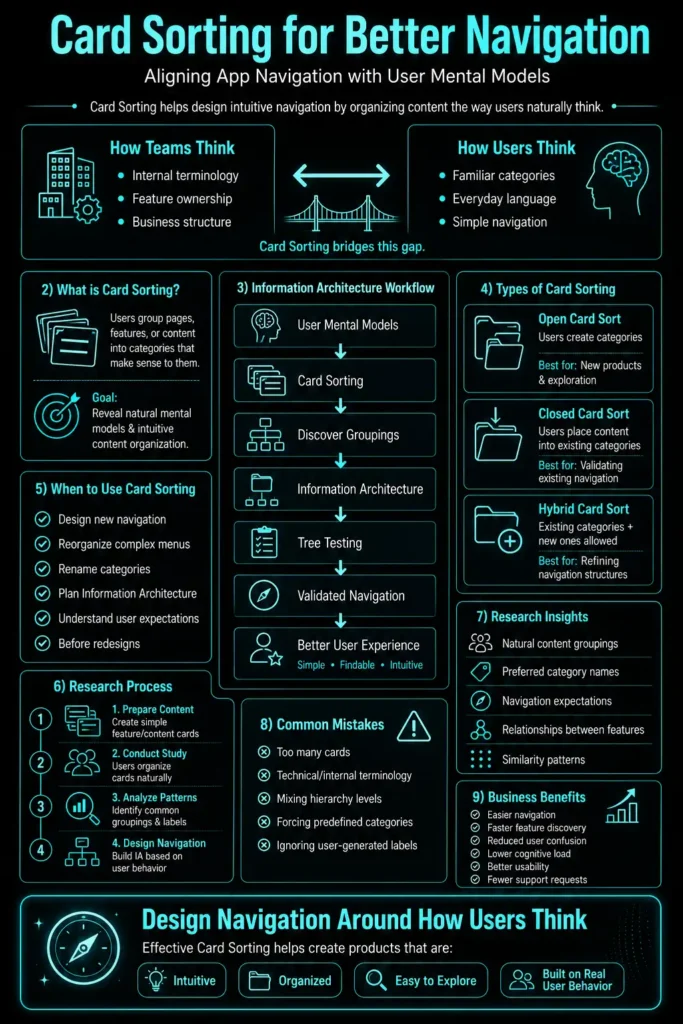
Card sorting is straightforward. You give people a set of labeled cards, each one representing a page, feature, or topic in your app, and ask them to group the cards in a way that makes sense to them. Sometimes they also name the groups themselves. The point is not to force the “correct” answer. The point is to uncover the language and structure that feels natural to users.
That makes it especially useful when an interface’s information architecture has grown messy. A banking app, for example, might have items like “Transfers,” “Bills,” “Statements,” “Card Limits,” and “Support.” A product team may think these belong under technical labels like “Account Services” or “Financial Tools,” but users may expect something far simpler, such as “Money,” “Cards,” and “Help.” Card sorting helps expose that gap before it becomes a navigation problem.
Card Sorting’s Place in Information Architecture
Card sorting is often talked about as if it produces a finished navigation on its own. It does not. It is one method inside a larger discipline called information architecture — the practice of organizing, labeling, and structuring content so people can find what they need and understand where they are.
Information architecture covers more ground than navigation alone. It includes hierarchy (what sits above what), labeling systems (the words used for categories), metadata and tagging (how content is classified behind the scenes), and findability (whether users can locate something through search, browsing, or both). Navigation is simply the visible outcome of these decisions.
Card sorting is usually the starting point in this process, not the end of it. It tells you how people group and label things. It does not tell you whether they can find something once a structure is built. That is a different question, usually answered later with a method called tree testing, where users are given a stripped-down version of the proposed structure (just labels, no visuals) and asked to find specific items within it. Card sorting builds the structure; tree testing checks whether that structure actually works.
A simple way to think about the sequence:
- Card sorting — discover how users think content should be grouped
- Tree testing — validate whether the resulting structure lets users find things
- Sitemap / IA documentation — formalize the validated structure into something the design and dev teams can build from
Skipping straight from a card sort to a finished navigation is a common shortcut, and it is where a lot of “confirmed by research” structures quietly fail once real users try to use them. The card sort tells you the logic feels right. Tree testing tells you it actually works.
Why it matters for app navigation
App navigation is really just the visible layer of a product’s information architecture — the point where structural decisions about grouping and labeling become something a user actually sees and clicks. If those decisions do not match user expectations, people slow down, backtrack, or give up. Card sorting helps reduce that mismatch by revealing the mental model behind the content structure.
This is important because most people do not approach an app by reading the site map or studying the product logic. They approach it the way they approach a supermarket aisle or a phone settings menu: they look for a familiar word, a familiar category, or a familiar pattern. If your structure matches that instinct, the experience feels easy. If it does not, even a well-built product can feel confusing.
A simple example: if someone is using a food delivery app, they are unlikely to think in terms of internal business categories. They will probably look for “Pizza,” “Burgers,” “Desserts,” or “Offers.” If the menu hides those under vague buckets, the experience feels heavier than it should. That is exactly the kind of issue card sorting helps uncover.
When to use card sorting
Card sorting is most useful at the point where structure matters but the information architecture is not yet fixed. That usually means early in a new product, during a redesign, or when the content has expanded and the menu no longer feels clean. It is also valuable when users keep struggling to find things and the team is unsure whether the issue is naming, grouping, or hierarchy.
A few common situations stand out:
- You are designing a new navigation system.
- You are reorganizing a bloated menu.
- You are validating labels before development.
- You are trying to understand how users think about a service or feature set.
- You suspect users do not share the team’s internal vocabulary.
For example, a healthcare app might group information under internal headings like “Patient Services,” but users may naturally look for “Appointments,” “Prescriptions,” and “Test Results.” A card sort can surface that difference early, before the wrong language gets locked into the interface.
The main types of card sorting
There are three common versions.
An open card sort asks people to create their own groups and name them. This is useful when you are still exploring how users think about the content. It is the best choice when the structure is uncertain and you want to discover patterns rather than confirm a fixed idea.
A closed card sort gives people predefined categories and asks them to place each card into one of them. This is useful when you already have a draft navigation and want to see whether it makes sense to users.
A hybrid card sort mixes the two. Users can place cards into existing categories, but they can also create new ones if needed. That can be useful, but it can also nudge people toward the structure you already have, so it needs to be used carefully.
A practical way to remember the difference is this: open sorting helps you discover, closed sorting helps you validate, and hybrid sorting sits somewhere in between.
How to run a useful card sorting study
The process does not need to be complicated, but it does need to be deliberate.
First, decide what you are sorting. That could be a full app, a section of a website, or one part of the experience such as account settings, support content, or product categories. The point is to keep the scope manageable and relevant.
Next, prepare the cards. Use short, plain labels that users will understand immediately. This matters more than people think. Internal terms that make perfect sense to the team can be unclear to everyone else. A label like “analytics” might be obvious inside the business, but a user may understand “reports” much faster.
Then, decide how the activity will run. In-person card sorting works well when you want to watch how someone thinks. Remote card sorting is useful when you need scale or faster turnaround. Both can work. The better choice depends on the research goal, not on which one looks more modern.
During the session, keep instructions simple. Tell participants there is no single correct answer and encourage them to sort in the way that feels most natural. In a moderated session, ask them to talk through their thinking. That often reveals more than the final groupings themselves. If someone hesitates between “Billing” and “Payments,” that hesitation can be more informative than the final placement.
Recruitment matters too. The users in the study should reflect the people who will actually use the product. A ux research agency or experienced researcher will usually pay close attention to this step, because weak recruitment can make the results look cleaner than they really are.
What the analysis tells you
Once the sorting is complete, the real work begins. You are no longer just looking at piles of cards. You are looking for patterns.
One useful output is a similarity matrix, which shows how often people grouped items together. If “Orders” and “Tracking” are consistently paired, that is a strong signal that they belong near each other in the navigation. If “Orders” and “Settings” rarely appear together, they probably should not be in the same bucket.
Another common output is a dendrogram, which is a visual way of showing how categories cluster together. It helps you see which items feel closely related and which ones sit farther apart. The technical name sounds heavy, but the idea is simple: it is a map of how users mentally connect the content—effectively, a blueprint for information architecture built from real behavior rather than assumptions.
The useful part is not just the numbers. It is also the language people use. If several users independently call a group “Account” instead of “Profile Settings,” that is worth paying attention to. The label users choose often tells you what will feel most natural inside the product.
A simple everyday example
Imagine a grocery delivery app.
The team may be tempted to organize it around internal categories like “Inventory,” “Promotions,” and “Fulfillment.” That may make sense behind the scenes, but it is not how people shop. Most users think in everyday terms: “Vegetables,” “Snacks,” “Drinks,” “Frozen,” and “Household items.”
A card sort would make that clear very quickly. Users might group “Milk,” “Butter,” and “Yogurt” together. They might place “Rice” with “Pasta” or split “Cleaning” from “Home Essentials.” Those choices are not random. They reflect how people actually search for things in real life. If the final navigation follows that pattern, the app feels easier from the first tap.
That is the core value of card sorting: it turns everyday thinking into design evidence.
Common mistakes to avoid
A lot of card sorts go wrong in predictable ways.
One common issue is using too many cards. When the list becomes too long, people get tired and start making shallow decisions. Another issue is mixing levels of hierarchy, such as combining main categories and sub-pages in the same exercise. That usually makes the results harder to interpret.
Another mistake is using confusing labels. If users need to guess what a card means, the test is no longer about navigation logic. It becomes a labeling problem. And that is a different issue.
A few other things are worth watching:
- Do not force categories that do not fit.
- Do not treat small differences as meaningful when the broader pattern is unclear.
- Do not over-guided participants with examples that bias their choices.
- Do not ignore the difference between what users say and what they actually group.
Good research is usually careful rather than clever. The cleaner the setup, the more trustworthy the result.
How the findings shape the final design
The final output of a card sort should not sit in a report and disappear. It should shape the navigation itself.
A ui ux designer can use the groupings to refine the sitemap, rename categories, and decide what belongs at the top level versus deeper in the structure. A product team can use the results to simplify menus, reduce duplicate paths, and make the interface easier to scan. A ux design agency may also use the findings to compare possible navigation models before a prototype is built.
This is often where the biggest value appears. A small label change can remove friction. A clearer grouping can reduce support tickets. A more intuitive top-level menu can save users from clicking around just to find one basic feature. None of that looks dramatic on a slide deck, but it matters in the product.
Why this matters for UX Prosperar
For UX Prosperar, card sorting fits naturally into a research-led design process. It supports better decisions around information architecture, navigation, content structure, and page naming without turning the work into theory-heavy overhead. It is practical research with a clear output: a structure that makes more sense to the people who actually use the product.
That is also why it belongs in the toolkit of any ux researcher or ux research agency working on apps with growing content or complex menus. It keeps design aligned with user behavior instead of internal assumptions.
Final thoughts
Card sorting is not about making navigation look neat on paper. It is about making it feel natural in use. When the structure reflects the way people already think, users do less guessing and more getting things done. That is the real win.
Used well, it gives a ui ux designer stronger direction, helps a ux design agency justify decisions, and gives a ux researcher clear evidence to work with. More importantly, it gives users an app that feels easier to understand.
For teams planning a redesign or organizing a cluttered interface, card sorting is often one of the smartest places to start. And for a product built around clarity, it is rarely wasted effort. If you want to fold this into a research plan for UX Prosperar, the next step is usually a short card sort study followed by a quick validation pass.
Typical project duration: 4–8 weeks, depending on scope.

At UX Prosperar, we don’t believe in one-size-fits-all. Every project has its own goals, users, and challenges, so the services we use depend on your specific requirements. Here’s how our offerings fit together to create products that both look stunning and work flawlessly.
1. UI/UX Design for Web, Mobile & SaaS
We design responsive, conversion-focused interfaces that adapt seamlessly across devices and platforms, whether it’s a corporate website, a mobile app, or a SaaS dashboard.
Often paired with:
- UX Research to understand your users before designing
- Wireframing to map the user journey before final visuals
2. UX Design and Research
Before any pixels are drawn, we dig into user interviews, usability testing, competitor analysis, and data review. This ensures every design choice is validated and goal-driven.
Often paired with:
- Customer Journey Mapping to align every touchpoint
- Usability Studies for deeper, real-world user insights
3. User Interface Design & Product Design
We simplify complex workflows into clear, user-friendly interfaces, from mobile apps to enterprise software. Our goal is to make interaction effortless and intuitive.
Often paired with:
- Design Sprints to rapidly prototype and validate ideas
- Content Strategy & UX Copywriting to ensure words guide users naturally
4. Product Design Services & Product Development Consulting
For startups and enterprises, we can support the entire journey, from early ideation to launch. You decide how deep we get involved.
Often paired with:
- Wireframing & Prototyping for early validation
- Usability Testing before development investments
5. Wireframing & Interactive Prototypes
Before code, we bring your product to life in clickable prototypes. This lets you test, iterate, and refine early, saving development time and cost.
Often paired with:
- UX Research to validate the flow with real users
- Design Systems to ensure consistency when scaling
6. Usability Testing & Usability Studies
We go beyond theory. We put your product in front of real users and watch how they interact. From quick hallway tests to in-depth usability studies, we gather insights that refine your product to be intuitive, smooth, and conversion-friendly.
Often paired with:
- UX Audits for a full product health check
- Customer Journey Mapping to ensure every touchpoint works together
7. Customer Journey Mapping
We map every step your users take before, during, and after using your product. This ensures all touchpoints feel connected and intentional.
Often paired with:
- Content Strategy / UX Copywriting to guide actions
- UI Design to visually align with the journey
8. Content Strategy / UX Copywriting
The right words help users take the right action. We craft microcopy, onboarding text, CTAs, and content flows that improve usability and conversions.
Often paired with:
- Design Sprints to test language quickly
- UI Design for perfect visual-text alignment
9. Design Sprints
When you need to move fast without compromising quality, we run focused 4-5 day sprints to rapidly ideate, design, prototype, and test ideas.
Often paired with:
- Wireframing & Prototyping for sprint outcomes
- Usability Testing to validate the sprint output
10. UX Audits
Is your product underperforming? We analyze it from usability, accessibility, and conversion standpoints to identify and fix issues.
Often paired with:
- Usability Testing for deeper user insights
- Customer Journey Mapping to spot big-picture issues
For some clients, the focus might be solely on UX Research + Wireframes. For others, it’s a full end-to-end process from research to product launch. The service mix is tailored to your goals, budget, and timeline. Each service is designed to work seamlessly with others for maximum impact.
UX Prosperar: UI/UX Design Agency With a Difference
- Consistent & Scalable Design Systems that grow with your product
- Cross-Device UX & UI Design Services for mobile, web, desktop, and SaaS
- Fast Prototyping & Iteration: see results early and often
- Developer-Ready Assets for smooth handoff and faster builds
Why Choose UX Prosperar for UI/UX Design?
Most agencies focus only on visuals. We start with research-led UX design, understanding your users, your business model, and your market, so your product doesn’t just look great, it performs.
Here’s why our clients love working with us:
- User-Friendly Interfaces – Websites, apps, and dashboards that feel effortless & responsive to use
- Scalable Design Systems – Future-proof designs that grow with your product
- Developer-Ready Deliverables – Clear, organized assets for smooth handoff
- Fast & Transparent Process – See results early, give feedback often
Industries We Serve
SaaS • E-Commerce • FinTech • HealthTech • Logistics • B2B Tools • Corporate Websites
Let’s Design a Product Your Users Will Love
Don’t risk launching a product that confuses users or loses them at the first click.
With UX Prosperar’s UI/UX strategic design services, you’ll get a hybrid, responsive, and scalable design backed by real user insights.
Book Your UX Audit Today
Let’s talk about how we can turn your digital product into something people want to use.