
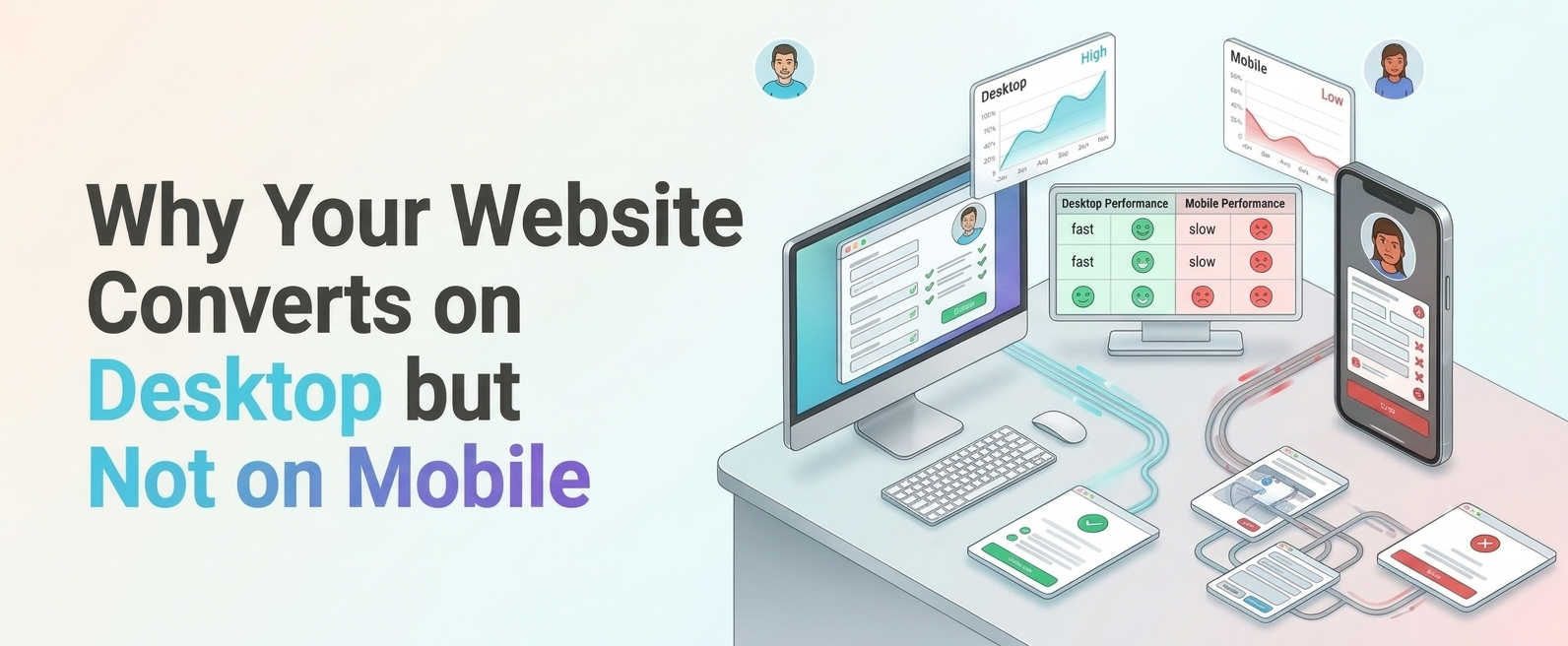
Your analytics report lands on Monday morning. Traffic is healthy, and more than half of it comes from phones. But the conversion rate on mobile is a fraction of what desktop delivers. A product design agency would look beyond traffic numbers to understand why mobile visitors are leaving without converting. The team’s first instinct is to blame the audience: “People just browse on mobile and buy later on a laptop.”
Sometimes that’s true. Often it isn’t. More often, the site is quietly making things harder for people on small screens, and they leave because of it.
Why Does Your Website Convert Better on Desktop?
Desktop gives your website a lot of advantages, most of which nobody planned.
There’s more screen space, so key information, navigation, and calls to action sit in view together. There’s a mouse, which is precise. There’s a full keyboard, so typing a card number or an address is quick. And the person on the other side is usually seated, focused, and on a stable connection.
Now flip it. On a phone, the same page is squeezed into a narrow column. Fingers replace the cursor. The keyboard swallows half the screen. The user might be standing on a train, half-watching a child, or squinting in sunlight.
Here’s the catch. Many websites are designed on desktop first, then adapted. The site is responsive, so it fits on a phone, but nobody has checked whether it works there. A layout that reflows into one column isn’t the same as an experience built around how people use phones.
The gap between the two conversion rates isn’t always a sign that mobile users are less serious. It’s frequently a measure of how much extra effort your mobile experience demands.
One caution before you fix anything: don’t assume. Some products do convert better on desktop by nature. Complex B2B purchases, long research journeys, and high-value decisions often involve multiple devices. Check whether people start on mobile and finish elsewhere before treating the gap as a defect.
What Mobile Issues Hurt Your Conversion Rate?
The usual suspects are simple, and that’s exactly why they get missed.
Forms that fight back. Long forms, tiny fields, the wrong keyboard popping up for a phone number, and error messages that appear only after you’ve hit submit. Each one is a small irritation. Together they end sessions.
Checkout that asks too much. Forced account creation, repeated information, unclear delivery costs that appear late. On a phone, every extra step costs more effort than on desktop.
Buttons and links that are hard to tap. Small targets, crowded together, lead to mis-taps. A customer who taps “Remove” instead of “Continue” doesn’t always come back.
Unclear calls to action. On a small screen, there’s little room for ambiguity. If the next step isn’t obvious within a moment, people hesitate, then leave.
Pop-ups and banners that take over. A cookie notice, a newsletter prompt and a chat bubble can cover most of a phone screen. Users trying to buy something don’t appreciate being interrupted.
Navigation copied from desktop. If someone needs three taps to find delivery information, the problem may not be the menu’s styling. The structure itself might not suit mobile users.
Content that’s hard to read. Dense paragraphs, small text, and weak contrast make scanning painful.
Here’s the useful part: you don’t have to guess which of these affects you. Look at analytics segmented by device to find where mobile users drop off, such as a particular page, form or checkout step. Then watch real people attempt that task. Analytics might tell you “users abandon the payment step.” Watching someone try will show you that they can’t work out what the billing address field wants. The first is a symptom. The second is the fix.
How Can UI UX Design Services Improve Mobile Conversions?
Good ui ux design services do more than redraw a layout for a smaller screen. The best ones start with the question that matters: why aren’t mobile visitors completing this task?
That usually means a process, not a makeover:
- Understand. Review analytics, session recordings, support tickets and customer feedback to see where mobile users struggle.
- Research. Talk to users and observe them completing key tasks on their own phones.
- Prioritise. Not every problem is worth fixing first. Focus on the friction that costs the most in lost conversions.
- Design. Rework the journeys, content hierarchy, forms and interactions around how people actually use phones.
- Test. Try the new designs with real users before launch, and afterwards through A/B testing where traffic allows.
- Optimise. Keep measuring. Conversion improvement is rarely a one-off project.
Notice that visual design is only one part. Often the biggest wins come from removing steps, rewriting labels, restructuring navigation or simplifying a form. These aren’t glamorous changes, but they’re the ones that move numbers.
If a redesign skips research and goes straight to a fresh look, you may end up with a better-looking version of the same problem.
Why Does Mobile Page Speed Matter?
Speed shapes every mobile experience, and it’s often felt before it’s noticed.
If a page is slow to appear, people lose patience or trust. If it looks ready but responds late to a tap, they lose their sense of control. And if the layout shifts as it loads, they tap the wrong thing. Any of these can end a session, and phone users are more exposed to them because connections and devices vary so much.
The usual culprits are large images and video, heavy scripts, third-party tags and chat widgets that add weight without adding value. Each one deserves to justify its cost.
Google’s Core Web Vitals offer standard measures for loading, responsiveness and visual stability. They’re worth tracking, especially using real-user data instead of only lab tests. But treat them as signals, not the whole story. A page can score well and still be frustrating if the checkout is confusing. Use the metrics to find slow spots, then test to see how they actually feel to users.
Speed also isn’t just about raw numbers. Showing useful content early, giving instant feedback when a button is tapped and using clear loading states all make waiting feel shorter.
How Can Web Design Improve Mobile User Experience?
If your customers are in the UAE, local context can decide whether a mobile experience feels natural or awkward. Good web design dubai work goes beyond visuals and takes account of how people in the region actually browse, read and pay.
A few things deserve attention:
- Bilingual experiences. Many businesses serve audiences who use Arabic, English or both. Language switching should be easy to find and should remember the user’s choice.
- Right-to-left layouts. Arabic isn’t just translated text. Layouts, icons, navigation and forms often need to be mirrored, and this needs testing on real devices. A form that works in English can break in surprising ways when flipped.
- Payment and delivery preferences. Customers may expect specific payment options, and delivery information often needs to reflect local address conventions. Check what your own customers use rather than assuming.
- Contact preferences. In many markets, customers like reaching businesses through messaging apps. If that’s true for your audience, make it easy on mobile.
- Cultural fit. Imagery, tone and content should feel right to the people you’re serving.
None of this can be settled from a desk. Research with real users in the market will tell you what they expect, where they struggle and what builds their confidence. That’s what separates a website that’s merely translated from one that’s genuinely designed for its audience.
What Is the Final Touch for Better Mobile Conversions?
There isn’t a single trick. The final touch is a habit: keep checking whether real people can actually finish what they came to do.
Start by finding where mobile visitors drop off. Watch real users to understand why. Fix the friction that matters most, starting with forms, checkout, navigation and speed. Test your changes. Then measure again, and keep going.
A few reminders worth keeping:
- A responsive site isn’t the same as a usable one.
- Analytics tells you where to look. Research tells you what to fix.
- Don’t try to fix everything at once.
- Local context matters, so test with the people you’re building for.
- Conversion work is never really finished.
If your desktop numbers look healthy and your mobile numbers don’t, that gap is an opportunity. A research-led UX partner can help you find the friction, test the fixes, and build a mobile experience that turns visits into customers.